AURA: building a mobile app with React Native for a medtech startup from London
How we created a mobile diagnostic app with highly intuitive UX/UI fit for elderly patients from scratch.
Summary:
-
Client
Entia
Country
London, UK
-
Project scope and technology
Mobile App Development, React Native Development, Business Processes Optimising
Industry
Medtech
-
Team Composition
1 Mobile Developer, 1 Mobile Designer, 1 Project Manager
Work duration
3 months
Entia is a MedTech startup from London simplifying healthcare by improving access to blood tests. Whether in the home or hospital, they enable individuals and clinicians to better diagnose and manage long-term health conditions to reduce costs and, most importantly, improve quality of life.
Challenge:
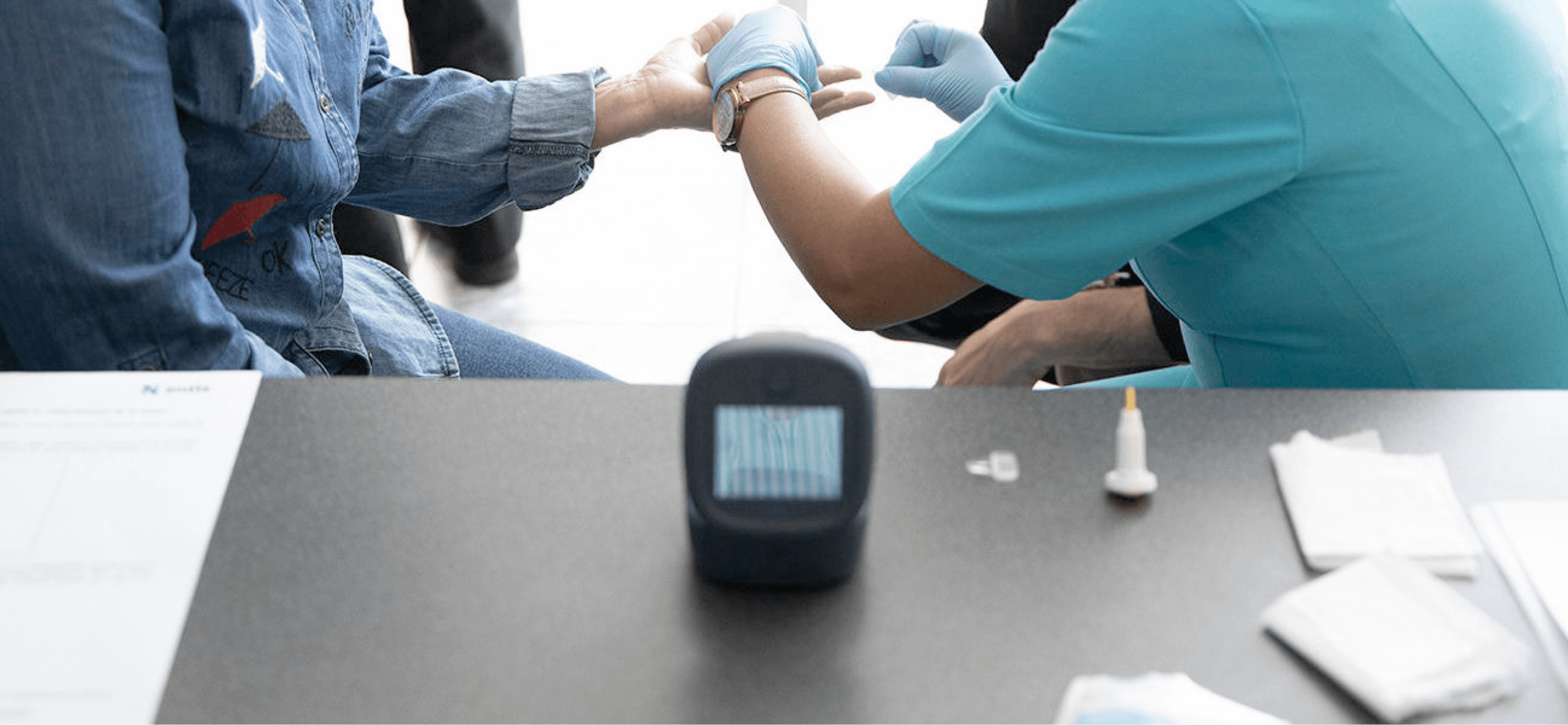
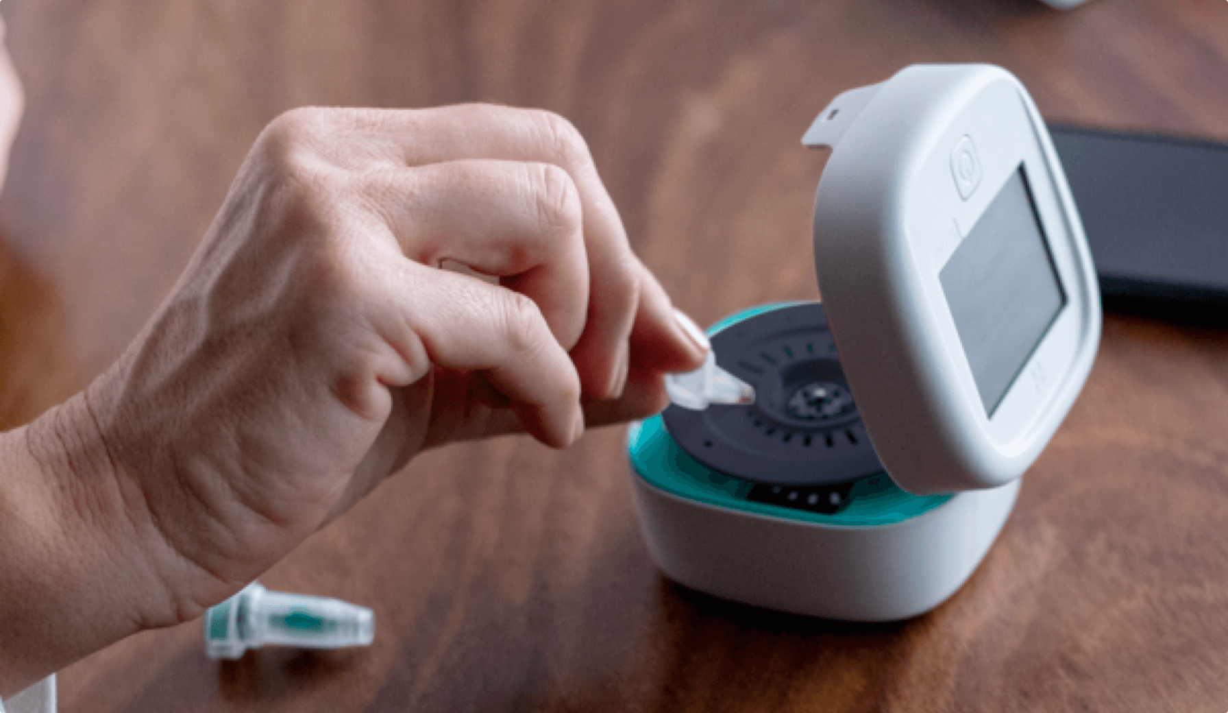
The Client came to us with a unique challenge: to create an app for hospital patients that would allow them to scan the results of their self-performed blood pressure test and sending them to the hospital instead of doing the test onsite with medical staff.
There was only an idea on the table, so execution required making everything from scratch, including full design and the entire development.
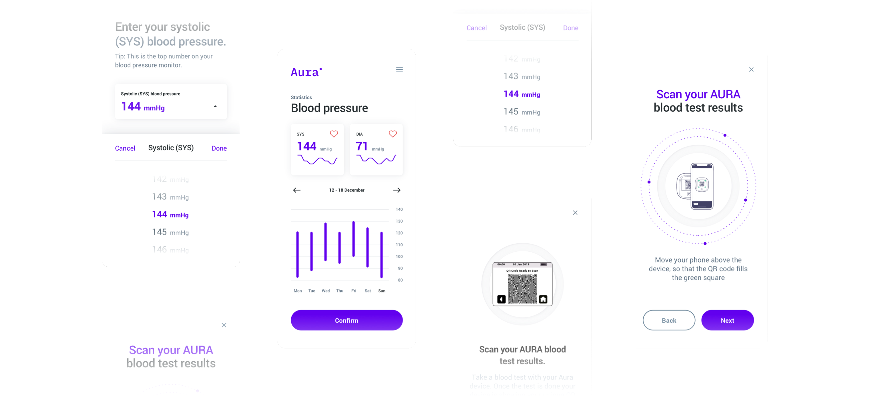
The application had to be designed to enable trouble-free use by regular users, as well as elderly patients or patients with various conditions. It had to be as simple as possible in terms of usability, with a carefully polished UX to reduce the risk of people not using it daily.
While designing the app, we identified some key health issues that had to be taken into consideration:
1. Problems with eyesight and vision (poor eyesight, difficulty seeing and interacting with small design elements, inability to see without good contrast)
2. Hearing problems
3. Motor limitation (including poor coordination, shaky hands, arthritis or loss of skin sensitivity)
4. General health issues (lack of concentration, forgetfulness, tiredness, problems with concentration)
Also, the design had to include Dynamic Text Size, as well as native iOS and Android elements, which made the development of the app far more challenging.
Process:
We started by crafting wireframes and preparing a design system.
The design had to include Dynamic Text Size as well as native iOS and Android elements, which raised the bar.
We designed a structured type hierarchy, where the Dynamic Text Size was included in tests.
Here are some other UX/UI solutions we implemented:
- Provided users with clear directions and tips on what they can or should do within the app
- Implemented large Touch Targets for buttons and considered that all the interactive elements should be within reach of the thumb (a “rule of thumb” ;) )
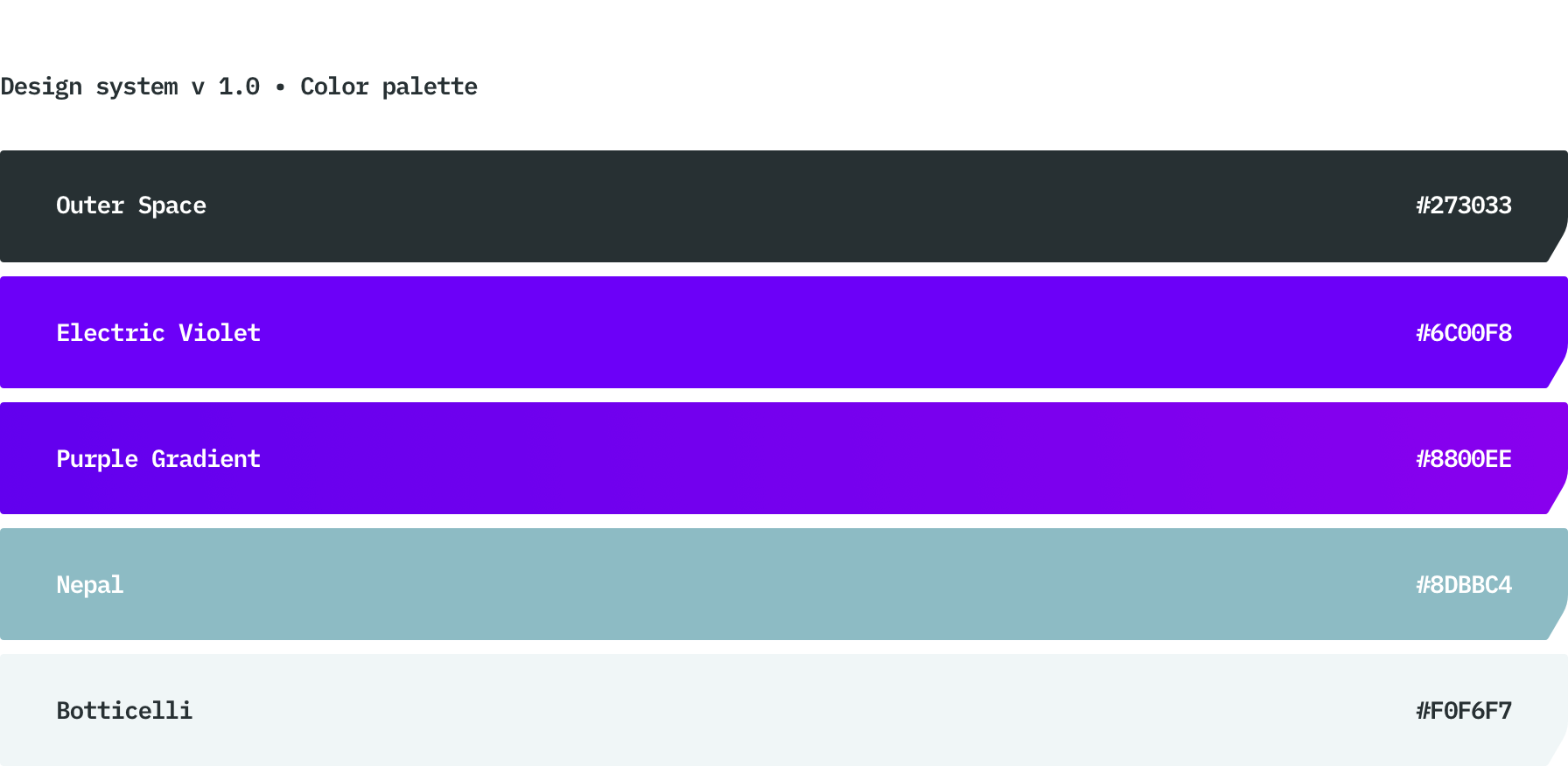
- Created a style guide for colors by studying the contrasts between colors and taking various color vision disorders into account
- Designing the app for white space: avoiding crowding the screen with information
- Designing a structured type hierarchy, where the Dynamic Text Size was included in tests. We used native iOS and Android fonts and Text Size to help determine contrast (bold and semibold).
- We completely gave up on sound signals or vibrations as a way of interacting with users
- We used native components to make the application as intuitive as possible for users.
For the development phase, we decided to go with React Native. The app had to be available both on iOS and Android and using React Native saved us around 30 percent of the development time.
We created a back-end for the app to save results locally on the device.
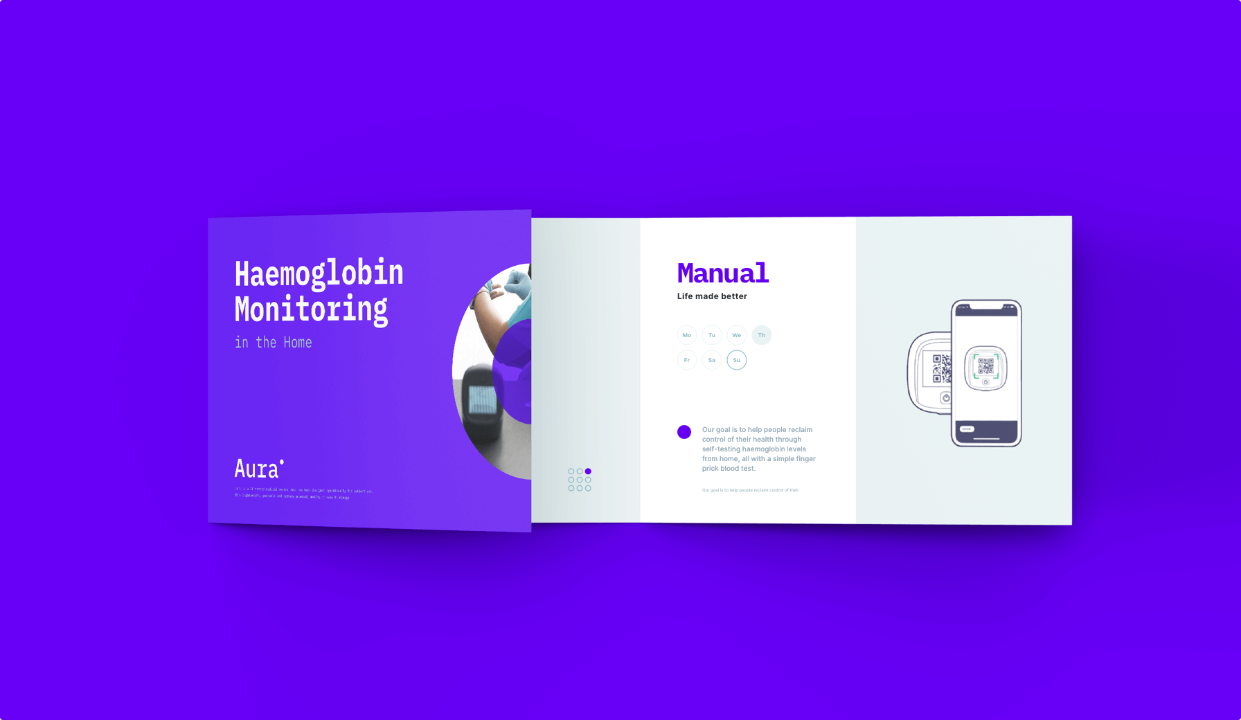
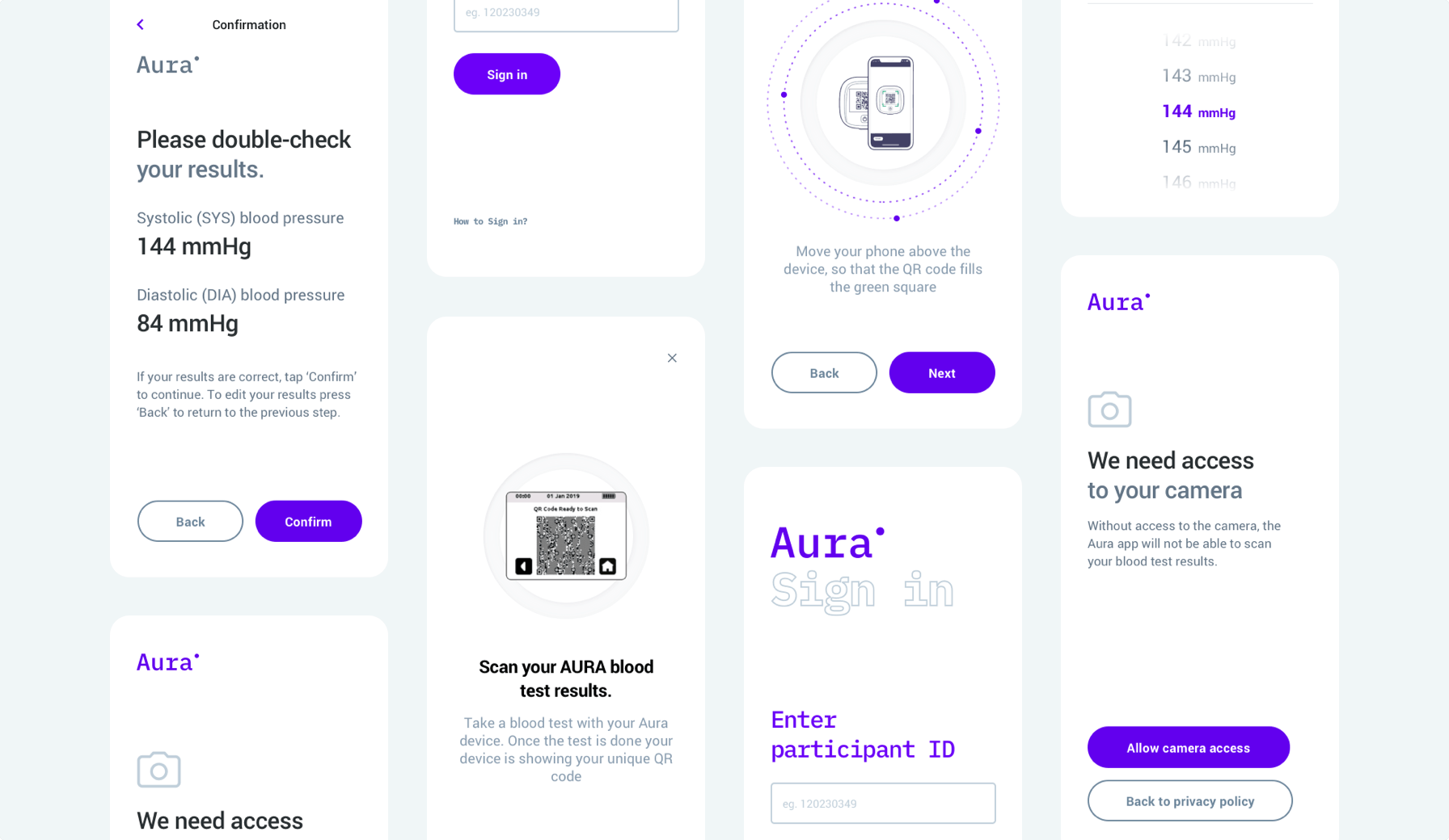
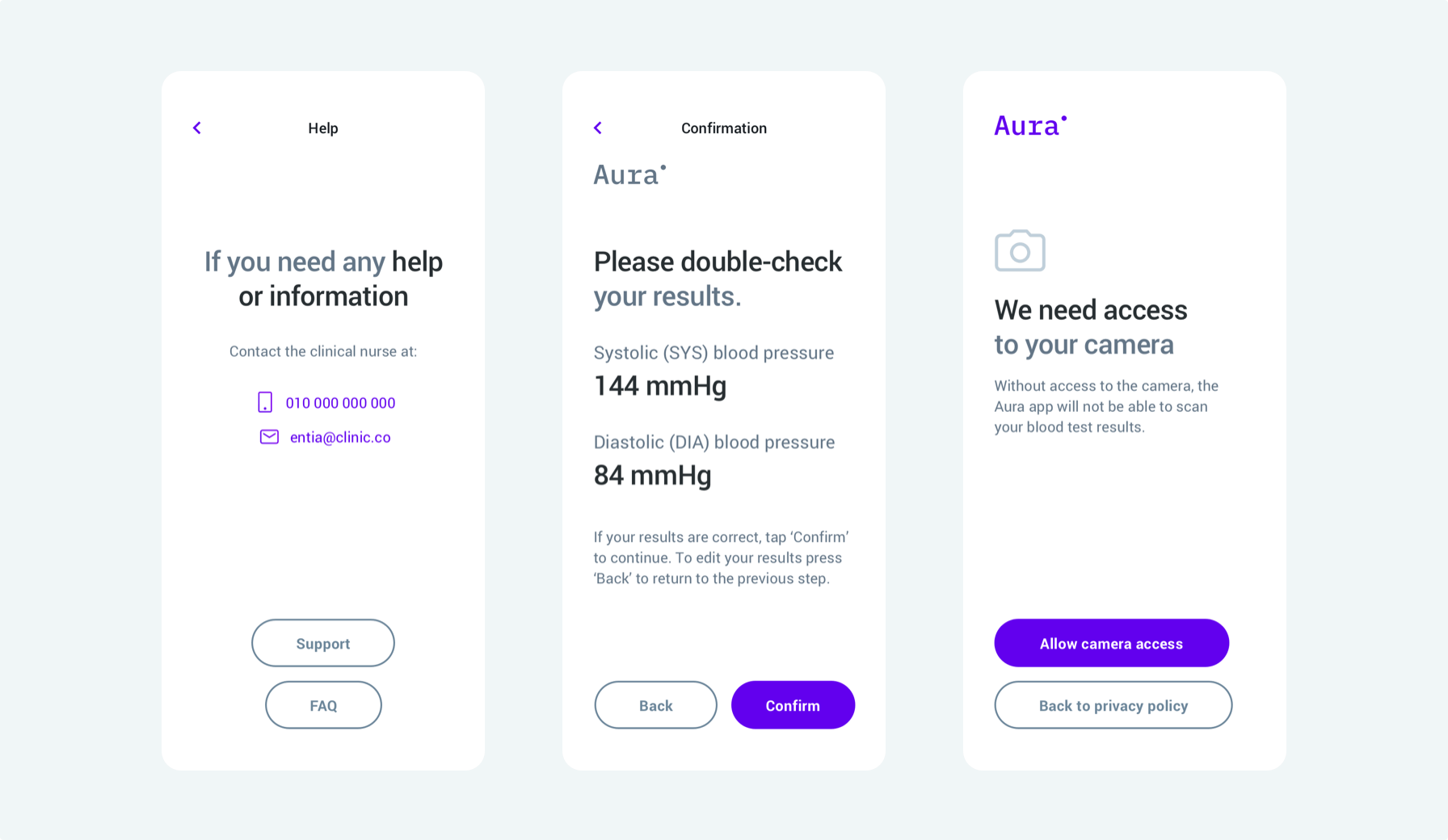
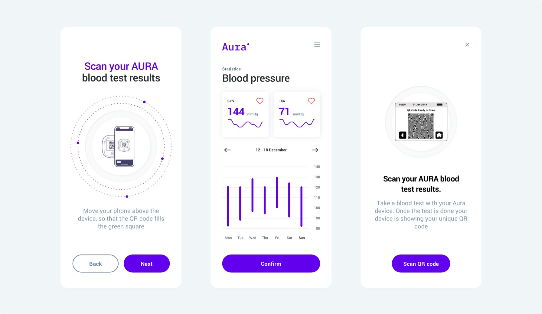
We also decided to implement the QR code scanner, so the data from the blood pressure measuring device could be scanned easily and sent to the hospital.
Outcome:
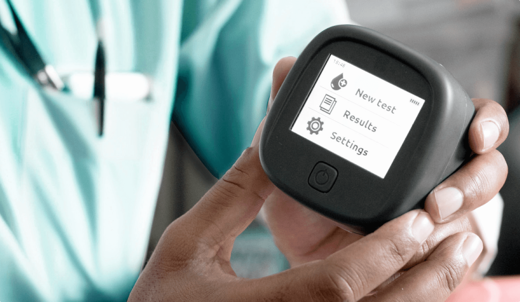
We created a highly intuitive mobile application suitable for elderly people to perform self-diagnosis. The app flow was 100 percent adapted to their needs - we used enlarged icons and a scaled font without damaging the flow of the application's appearance.
We stuck to minimalistic and simple design so the icons are easily visible among other app elements.
As a result, scanning and saving results is very easy and quick for the users, as well as sending the diagnostic data straight to the doctors.
Patients can use the app at home, without any additional stress or need to go to the hospital. It saves their time as well, as makes the work of medical staff far easier. Nurses and diagnosticians can just collect the data from the tests without needing to perform the tests themselves onsite.
- 2 weeks crafting the design
- 2 months full app development
The design is accessible for many users, making the project a success. Ideamotive was organized and communicative throughout the engagement. As a result, they have a strong partnership.
Silvia Novak
Product Owner, Entia
Schedule a free consultation and check if a similar solution applies to your business.
We helped Entia and dozens of other companies. Reach out to us and learn what our tech talent network can do for your business.
Rated 4.8 / 5.0 by clients from various industries and locations.

