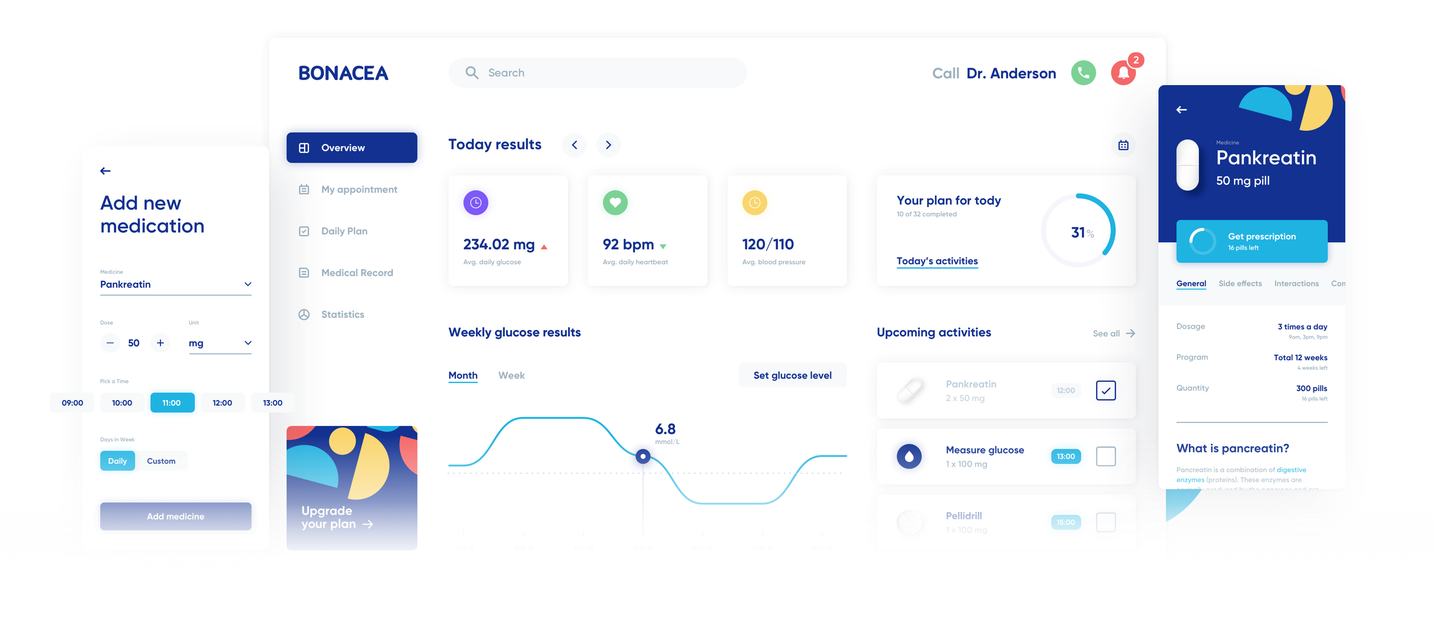
Bonacea: designing UI/UX for a medical IoT startup
How we created a complete UX flow and working prototype for the medical diagnostic app available on various devices - from smartwatches to full HD smart TVs.
Summary:
-
Client
Bonacea
Country
USA
-
Project scope and technology
Mobile Development, UX/UI Design
Industry
Medtech
-
Work duration
1 month
Bonacea is a young medical startup aiming to help people throughout their long-term treatments. A set of hardware devices and sensors measure customized parameters of a patient's body. All the data is analyzed by an AI neural network and if an abnormality is found, a notification is sent directly to a doctor. The mobile and web apps remind users to take their medication and keep track of dosing. They are also hubs for treatment progress and history.
Challenge:
Bonacea is a large, complex project involving software and hardware. The main objectives were for it to be easy to set up and intuitive to use. We were asked to prepare UX and UI concepts for the web and mobile interfaces. This time, "mobile" also meant... smartwatches.
Here are the challenges that we faced:
- developing a clear UX flow within an application, consistent among devices
- creating an intuitive UI for various types of screens — from 4k monitors to smartwatches
- giving clear and straightforward information on medication dosing
Process:
We started by defining stakeholders and final users of the app. Then we gathered and analyzed UI/UX requirements from all of them. Our UX team created flows for various devices and app roles. At this stage, we agreed on the overall functions of the app. Afterwards, we started prototyping low-fidelity designs, along with gathering more specific requirements. When that was completed, discussed and accepted, we agreed on the final form of the system and began drawing designs.
What did we achieve?
- we designed UX flows for computer screens, smartphones and smartwatches
- we drew low-fidelity mock-ups to ensure a common understanding of the project
- we built a clickable prototype to mimic the final UX of the app
- we created high-fidelity mockups
- we designed the final layout using a design system delivered by our UI team
Outcome:
Bonacea received the complete design of the system for all devices. The process of gathering requirements and drawing low-fidelity mockups helped save a significant amount of money by avoiding costly modifications during the development. Additionally, we made sure that everyone involved had the same understanding of the final product by building clickable prototypes. It reduced further discussions and increased productivity during the next phases of building technical architecture.
Here is the summary:
- we discovered differences between stakeholders' visions early in the process
- we made a prototype before writing the first line of code
- we created a design system that allowed the designers to quickly create new pages with blocks
- 5 Types of Devices
- 160 Design Elements
- 200+ mock-ups
Looking for UX/UI development experts?
Get in touch with us and we'll provide you with the team of talents perfectly matching your industry, technology and company culture.
We helped Bonacea and dozens of other companies. Reach out to us and learn what our tech talent network can do for your business.
Rated 4.8 / 5.0 by clients from various industries and locations.

