In web design, there’s no stopping point. Even veterans must continually upgrade their skills and expand knowledge to stay on top of the game. One of the means of achieving this is to become inspired by accomplished masters of the trade. What better advice to get than from the experts themselves?
As agile web developers, we understand the pressure to keep your skills current. That’s why we put together ten pieces of advice from the world’s top web and UX designers. With these tricks of the trade, you will turn your next web design project up to eleven!
- Usability Comes First. Always
- But… Creativity Treads On Its Heels
- Amazing Websites Need Holistic Web Development
- Dark Mode? Easier Said Than Done
- Typography Counts
- Tools Are Just Tools
- Expand Your Horizons
- And Don’t Take Animation For Granted
- Tell Short-Lived Design Fads From Lasting Trends
- Learn From The Mistakes Of Others
10 Quintessential Lessons From The World’s Top Web Designers
1. Usability Comes First. Always
“Innovation is great, but usability is much more important.” When Jeffrey Zeldman, the king of web standards, says so, one cannot disagree.
While for experienced web designers, usability is a given, novices often tend to push too hard for innovation or artistic vision at the expense of the ease of user interaction. Meanwhile, websites that are difficult to navigate experience much higher bounce rates, and lower return visit count.
88% of online shoppers don’t return to a website after having a bad user experience. When users struggle to achieve their goals with a website or web app, they leave frustrated and are unlikely ever to come back, which is bound to affect the company’s revenue. Enhancing the UX design leads to increased website traffic, higher conversion and, ultimately, greater sales.
2. But… Creativity Treads On Its Heels
UX takes priority in boosting conversion and enhancing the effectiveness of web apps and pages, but this is not to say that creativity is unimportant.
As a renowned web and UI designer, Mike Kus, rightly observes, “In the face of web automation, being creative, bucking trends, carving your own path is the best way to out-pace an ever more sophisticated and automated web. Hold on to creativity; it’s that last thing that computers will steal from us.”
A rule of thumb is to design web products with the audience in mind first, and then bring your personal, unique style into the work.
3. Amazing Websites Need Holistic Web Development
“The challenge of design systems work is helping teams think in more cross-functional, interdisciplinary ways. They need awareness on how changing a single slice will affect the hyperobject—or, more specifically, how it will affect the other teams and people who work within the system.”
In his iconic blog post, Ethan Marcotte, a.k.a. the father of responsive web design, raises an important question of web development as a team effort.
Especially in the era of freelancing and remote work, web design and development are often perceived as solitary professions. Wrongfully so. The process of designing and developing a website is an extremely complex one, and it involves a cross-functional, interdisciplinary approach where each person should understand how their work impacts the remaining contributors.
4. Dark Mode? Easier Said Than Done
In the course of the last few years, dark themes have seen a noticeable spike in popularity. They are elegant, minimalist, and supposedly easier on the eyes and battery. However, their implementation involves some level of complexity. “Implementing dark mode is easy, but designing for it is less so,” warns Andy Clarke, one of the world’s best-known web-designers.
For a dark background to work and provide your web products with a sophisticated, distinguished look, it needs to follow a few crucial principles.
First of all, you must ensure a high level of readability and accessibility to provide user’s comfort and avoid straining the sight. A second important consideration is the contrast, which dictates the choice of colors for the interface. Thirdly, the dark mode design should complement the look of the user’s environment. An effective dark background also requires altering typography styles that can adapt to changing light conditions.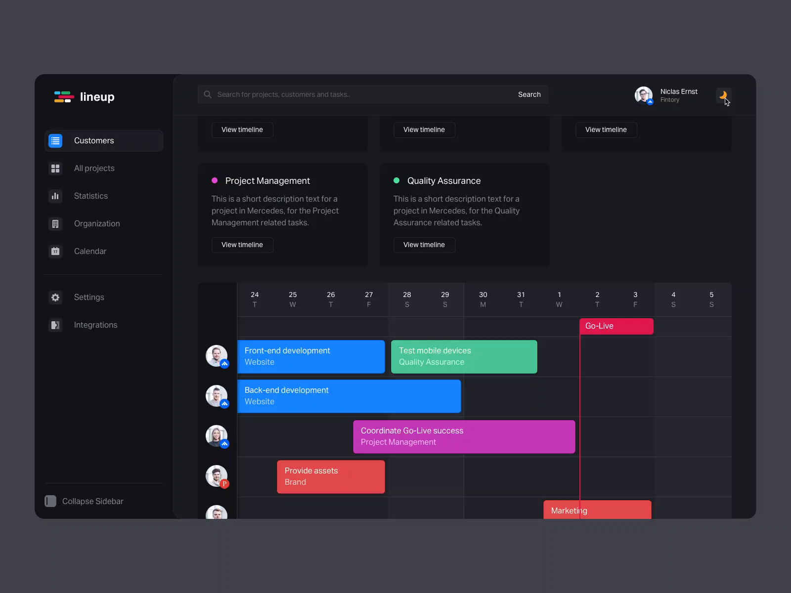 5. Typography Counts
Speaking of which. Do you remember the times when virtually all websites were using either Arial or Times New Roman? They still rank first as fallback fonts, but currently, almost 60% of websites use custom typefaces, which shows an increasing awareness of the significance of typography for web design. But why is it so important?
Topography determines much more than just the type and size of fonts to use. It embraces line and character spacing, paragraph indenting, bullets, hanging punctuation, and more elements that impact a web product’s readability, design, and accessibility.
As Gitlab’s UX Designer, Matej Latin, explains, “Rhythm in typography is just like rhythm in music. Just like in music, where order is more pleasurable to our ears than chaos, so is a well-designed text with an established rhythm easier to read and more enjoyable to consume by our eyes.”
6. Tools Are Just Tools
Another important lesson in web design comes from Cameron Moll, Facebook’s former Head of Design, who recommends not to obsess about tools too much. Moll says, “Tools are not as important as a foundation of thinking creatively. Tools will change throughout your career, and industry software might even be replaced by the time you graduate. Learn the fundamentals of design that are transferable to any tool you’ll use.”
Indeed, despite the proliferation of tools that are requisite for web design & UI work, getting too attached to particular utilities is a common mistake that designers make.
Every professional should have an essential toolkit to perform day-to-day tasks but rather than becoming an advanced user of particular features or software, it’s more important to master the fundamental skills such as the principles of design, coding, photo editing, visual design, UX, typography, color theory, and composition.
7. Expand Your Horizons
In web design, versatility also applies in a broader context. “Taking inspiration from outside the web. Flipping through any of these books sparks dozens of ideas for new layout designs. Reading science and theory teaches me the why of when to make which choices.” That’s how Jen Simmons, Designer & Developer Advocate @Mozilla, creates her amazing work.
There is a vast body of knowledge you can exploit in web design to make it powerful and effective. For example, an interest in art will recharge your creative juices and make it easier to develop an individual, authentic style. By exploring human psychology and behavior, you can better comprehend which design elements elicit a specific response from the users. The knowledge of business and marketing fundamentals will help you improve the understanding of your customers and meet (and exceed) their expectations. \
8. And Don’t Take Animation For Granted
For years, we were witnessing a rift between web and animation designers. The former were often displeased with the quality of motion design and feared animated elements would slow down websites, negatively affecting the user experience. Fortunately, it’s no longer the case.
As web development has matured, purposeful, well-designed animation such as dynamic backgrounds, loading screens, or visual feedback, can positively shape the user experience, not only by enhancing the website’s aesthetics but also by facilitating navigation and sustaining users’ interest with the site or app.
“Web animation can be so much more than just decoration, but only if we make it part of our design process. It can’t be a meaningful addition to the user experience if you don’t include it in the early conversations that define that experience,” says Val Head, Senior Design Advocate @Adobe.
 9. Tell Short-Lived Fads From Lasting Trends
Remember hamburger menus, infinite scrolling, and carousel ads? We’d rather forget they ever existed. Each year, the web design scene experiences a new wave of creative ideas. While some of them are worth keeping, most go out of fashion as soon as they appear.
Savvy web designers and developers know how to identify and adapt disruptive trends that drive fresh and inspiring designs, and tell them from short-lived fads that can ruin any site and app with the look that feels outdated shortly after its implementation.
Shane Mielke, an award-winning Creative Director, Designer, and Front-end Developer, explains the hazards of giving in to passing fads in web design, “I think a lot of the current design trends are amazingly boring and uninspiring. Designs have gone backward in time to resemble stylized UX with a couple of basic colors, some fonts, and some pictures rather than extensions of a designer’s personality and style.”
10. Learn From The Mistakes Of Others
This thought has been attributed to many, but in essence, it always boils down to the same point. While mistakes are an essential stage of the learning process, avoiding some of them by learning from others can save you a great deal of time (and frustration).
“Designing websites is hard and takes a lot of practice to get it right. If you’re anything like me, you’ve made plenty of mistakes while doing it. I think it’s important to point out common mistakes so we can transition them into success,” says Jesse Showalter, one of the most popular YouTubers among UI/UX Designers & Developers.
Poor readability, messy layout, bad navigation—these are just a few basic traps you can bypass by following the advice of top web and UX designers, and reading professional blogs and other resources.
Would You Like to Amp Up Your Web Design?
Web design and development are highly-demanding professions, which require a wide array of skills and vast expertise. However, a curated team of creative web professionals with experience in agile project development can turn your usual web app or site into a sales powerhouse. That is why if you need a hand with your next web project, it’s essential that you rely on trusted specialists. Fortunately, you don’t have to look too far ;)

 5. Typography Counts
 9. Tell Short-Lived Fads From Lasting Trends


