Undeniably, 2022 was a challenging year that most were eager to leave behind. Yet, amidst the trials, some standout aspects remain noteworthy into 2023, such as the innovative collection of 21 mobile app UI designs that emerged during that period, offering superb design inspirations worth retaining and revisiting.
Global consumer spending in the mobile app sphere skyrocketed to a record-setting $111 billion, covering in-app purchases, subscriptions, and premium apps. This represented a substantial increase of over 30% from the previous year. As we move forward into 2023, it's crucial for organizations with an eye towards growth to leverage these trends and allocate adequate resources towards enhancing their mobile user experiences, given the demonstrated potential for soaring revenues in the mobile app sector.
To help them, we’ve combed through Dribbble resources, bringing twenty-one examples of the most appealing mobile app UI design that ooze style, elegance, and imagination. They seamlessly incorporate recent mobile app UI design trends and best practices while focusing on the single most essential element of superior UI design — an enticing user experience.
Let’s step back in time for some mobile UI design inspiration to kindle your creativity in 2023!
Best Mobile App UI Design Examples We Saw In 2022 & 2023
Year by year, UI/UX mobile design trends come and go. While you shouldn’t follow all of them religiously, understanding what’s hot and what’s not will allow you to stay ahead of your competition.
What’s in? In 2023, we expect to see even more extensive dark mode use, 3D graphics, and simple, thick typography in mobile app design. Neumorphism will continue to gain traction in evolved and more sophisticated forms.
As for color schemes, pastel backgrounds and light-toned UIs will still be big, but bold and youthful brands will sway towards neon flashy palettes. And, of course, you can never go wrong with stunning visuals, hyper-realistic textures, images and animations, and AR/VR enhancements.
If you are looking for fresh examples of UI design to inspire your next mobile app, you’re in the right place. These twenty-one designs stand out with bold typography, high-contrast color combinations, responsive layouts, and liquid swipes, among other trends. Are you ready to explore them?
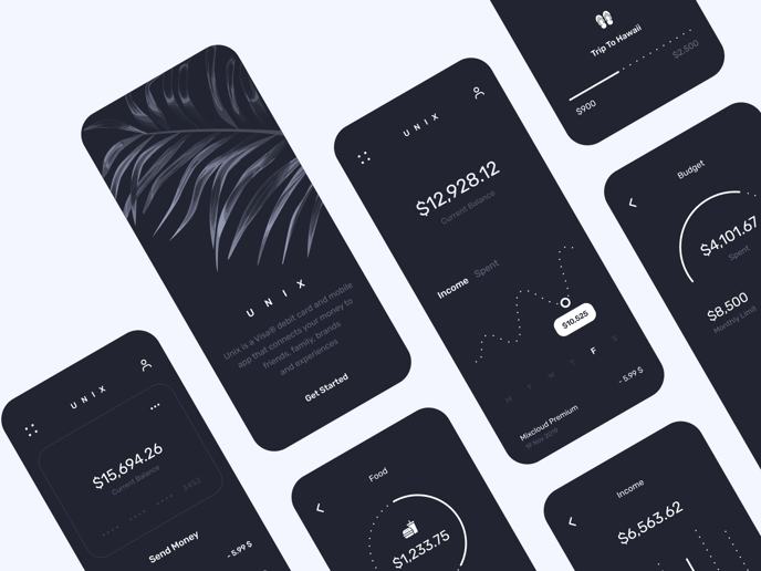
1. Unix banking app by Victa Wille
What we love about this design: elegant design, dark mode, plain typeface
Dark theme is the defining feature of this high-class design. Apart from being aesthetically pleasing and elaborate, it also reduces eye strain, saves battery power, and makes particular UI components stand out.
Source: Dribbble
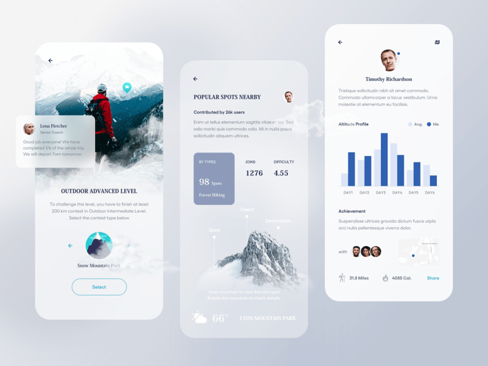
2. Climber contest app by Yi Li
What we love about this design: realistic graphics, immersive 3D elements, lightweight look & feel
Most people find pure data and numbers incredibly dull. The UI designer of this stylish app has used a combination of highly realistic images, personalization, and discreet design to make them meaningful. And visualized data reads much better than Excel, doesn’t it?
Source: Dribbble
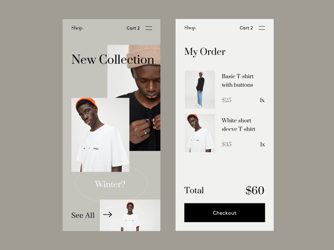
3. Shop app by Giga Tamarashvili
What we love about this design: broken grid, empty space, layer overlap
In UI design, minimalism speaks volumes. This shop app puts products in the spotlight thanks to white space and prominent fonts’ skillful use. The color scheme is subdued, so it doesn’t distract the user from the merchandise.
Source: Dribbble
4. AR experience home rent by Sajon
What we love about this design: AR-enabled interactivity (duh!), lucent design, soft-hued color palette
With remote-everything, in 2020, AR/VR experiences made another comeback. Virtual home tours turned the real property market upside down, and they are likely to stick around for some time. This app takes advantage of the trend, leveraging the potential of augmented reality to provide a hyper-realistic home viewing experience. And it does it with style!
.gif?width=456&name=AR-experieence-home%20(1).gif)
Source: Dribbble
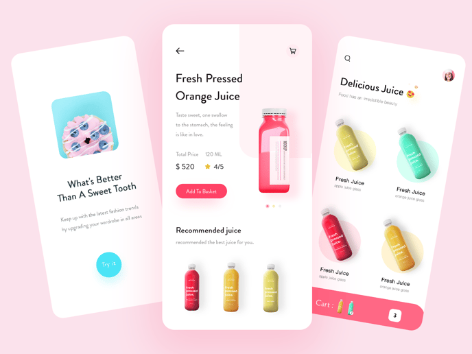
5. Food delivery service app by Marcus Leo
What we love about this design: vibrant colors, neat layout, distinctive CTAs
We cannot help but adore this new-minted, zingy app design! Everything goes together here - smooth-edged shapes, lively colors, and compelling product photos. The app perfectly matches the market it targets and puts the sold items on center stage, where they belong.

Source: Dribbble
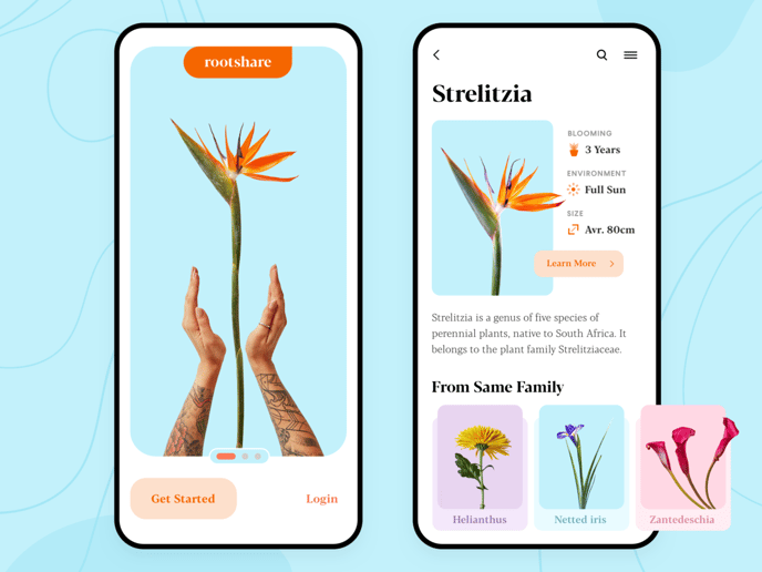
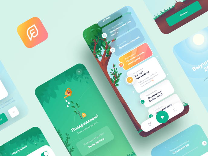
6. Mobile plant app by Semas
What we love about this design: awesome illustrations, rounded corners, standout fonts
Another gorgeous app on our list makes use of full-screen visuals that are a joy to behold. Sometimes, less is more, and beauty is all you need to attract and sustain mobile users’ attention. Note how the image suddenly pops onto the text box on the second screen, naturally drawing the users’ eyes in its direction.

Source: Dribbble
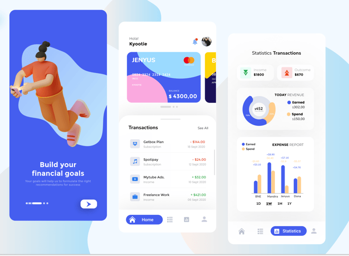
7. Financial management app by Afrills
What we love about this design: bottom navigation, color overload, effective data visualization
Sometimes fitting the content into the limited screen space can be challenging. This UI designer managed to do it using a well-organized layout and user-friendly bottom navigation. Additionally, the masterly use of bold, eye-popping design and edgeless shapes proves that a banking/finance app doesn’t have to be drab.

Source: Dribbble
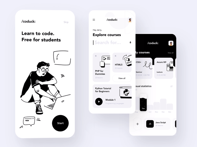
8. Coding app by Taras Migulko
What we love about this design: comic strip-inspired UI, human writing, uncluttered design
This black and white cartoon UI may not necessarily appeal to everyone’s taste. Which is all very well, because it doesn’t have to. But we are 100% positive that its unadorned design paired with clear cut microcopy will hold the attention of most aspiring programmers - who are the app’s target audience.

Source: Dribbble
9. Language learning app by Anatoliy
What we love about this design: visual storytelling, vibrant color scheme, organic shapes
Language learning apps increasingly leverage an immersive experience and storytelling to facilitate knowledge acquisition, retention, and recall. This mobile app is a nice take on creative visual storytelling, playing with different colors, and transparent UI design to help learners stay focused and engaged.

Source: Dribbble
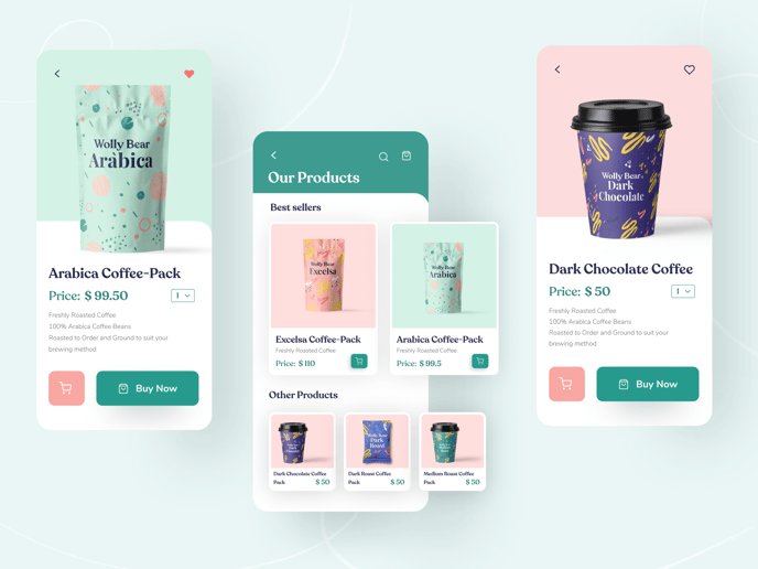
10. Wolly Bear Coffee by Swati Nirwal
What we love about this design: soft drop shadows, a combination of serif fonts, consistent brand identity
Here’s a fabulous example of a highly functional product-oriented mobile app UI design. The easily readable font combination and prominent buttons enhance user interaction with the product. The soft shadows and floating visuals are seemingly a tiny detail, but one that adds a splash of hyper-reality, transcending the boundaries between the digital and physical space.

Source: Dribbble
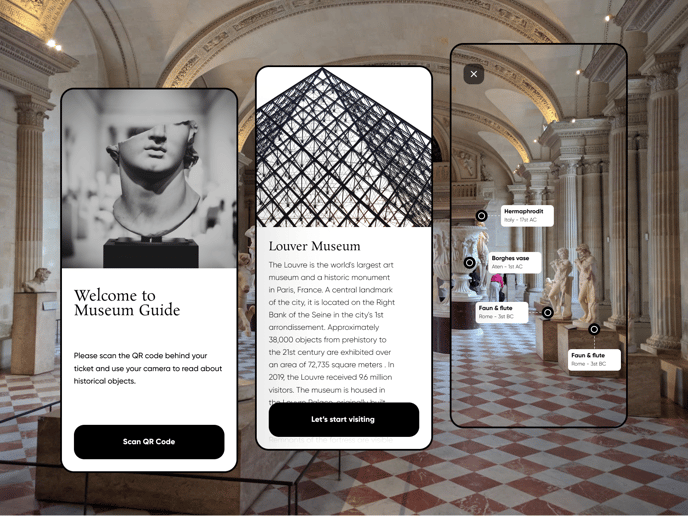
11. AR museum guide by Pegah Navid
What we love about this design: hyperrealism, elegance, bite-sized content
Yes, it’s augmented reality again, but we couldn’t help it. We just love this robust, hyper-realistic mobile UI design. It couples beauty with functionality, enriching real-life experiences with a mixed reality approach. As a result, the app can support virtual and onsite visitors - navigating those inside the Louvre through its maze and providing rich context to the art pieces or taking online visitors on a virtual tour of the museum.

Source: Dribbble
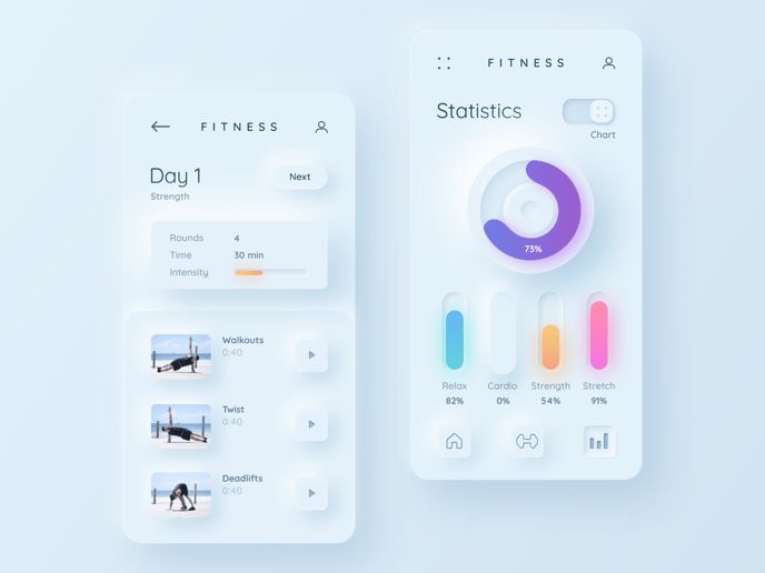
12. Fitness neumorphism by Mary Tokar
What we love about this design: neumorphism, obviously
2022 marked the revival of skeuomorphism, and 2023 is about to see the trend explode in its modern format. What are its defining features? Minimal color contrast, rounded-edge shapes, gradients, and drop shadows - all of which are present in the example below. While this style is catching on, it doesn’t go well with every app. So before you dive headfirst into it, run your idea through a team of experienced UI/UX designers who can assess whether it’s the right match with your product.

Source: Dribbble
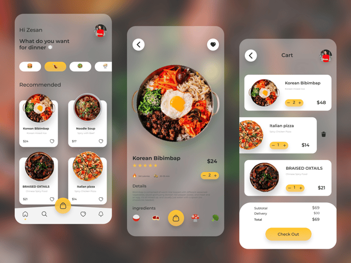
13. Food mobile app by Zesan H.
What we love about this design: frosted glass effect, fab photos, ingredient icons
The next mobile app UI design on our list showcases another morphism. Glassmorphism is all about transparency, vivid colors, and a multi-layered approach. When skillfully applied - like in this app - this design trend looks ultra-modern and enhances the user experience.

Source: Dribbble
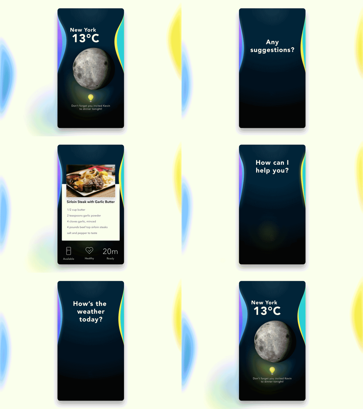
14. AI assistant by Duy Luong
What we love about this design: voice user interface, sense of anticipation, smooth flow
Voice commands have been catching on for quite some time already. But since 2020 made us all much more aware of the importance of cleanliness and hygiene, they’re bound to dominate this year’s mobile UI trends as a touchless technology. What we love about this AI assistant, in particular, is the way it illustrates voice control with its smooth, flowing interactive animation.

Source: Dribbble
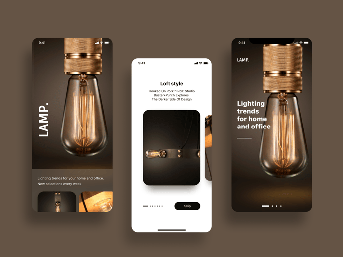
15. Product feature app by Marina Dmitruk
What we love about this design: gesture navigation, low-light UI, near-tactile shopping experience
Instead of going full-on buttonless (a growing UI design trend), this app design retains buttons where they’re necessary. Still, it keeps them to the minimum, prioritizing liquid swipe and other hand gestures to browse through the product catalog. A well-kept balance between beauty (the quality of visuals is superb!) and functionality is its secret weapon.

Source: Dribbble
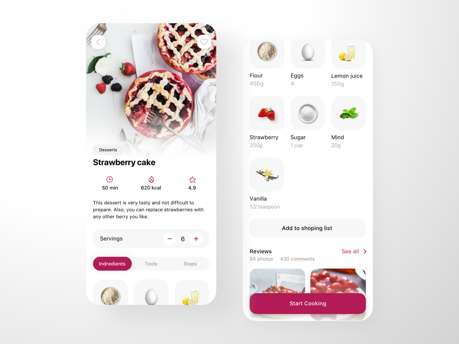
16. Recipes app by Tetiana Vozniak
What we love about this design: expressive design, appealing images, functional UI
Clarity, readability, accuracy, detail, and structure. There are as many ingredients to concocting a well-written cooking recipe as to building a functional mobile app. In addition to being visually pleasing, this mobile UI design offers a neat, well-organized layout that immediately points the users to all the information they need.

Source: Dribbble
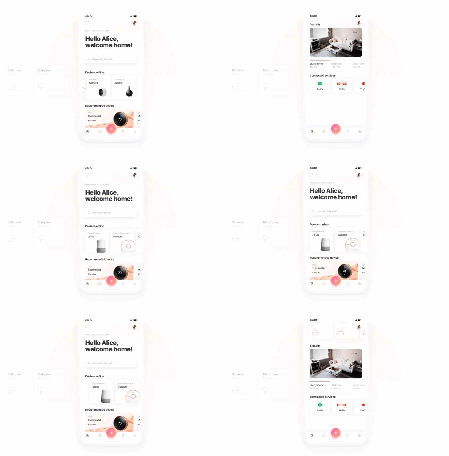
17. Smart home assistant by Dawid Młynarz
What we love about this design: engaging interaction, AI integration, efficient layout
There are many elements to this next mobile app that we find appealing. One of them is the engaging interaction that speeds up navigation and helps grab the user’s attention. Lightweight, custom icons paired with heavy fonts and a gentle color scheme add an extra feel of modernness to the cutting-edge app.

Source: Dribbble
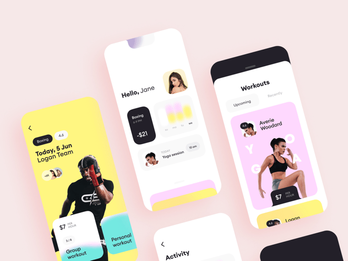
18. Workout app by Alex.S
What we love about this design: overlapping graphics and photography, distinct visual hierarchy, balanced composition
Just looking at these fancy colors makes us want to grab a pair of dumbbells. The vibrant, cheerful hues are an ultimate energy booster, which is ideal considering we’re talking about a fitness app. The app’s rounded, organic shapes go well with the minimalist, flat buttons, making the design easily-accessible, engaging, and pleasing.

Source: Dribbble
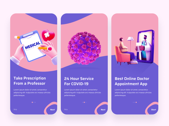
19. Onboarding screens by Shafiqul Islam
What we love about this design: bright colors, consideration for the thumb zone, visual consistency
Breathtaking visuals are what brought our attention to this medical app’s onboarding screens. Despite the unusual choice of the color scheme (considering the industry), these creative illustrations succeed in visualizing the ideas conveyed in the copy in an accessible and efficient way. As a result, they bring delight to the user experience, at the same time helping the user to advance through the onboarding process.

Source: Dribbble
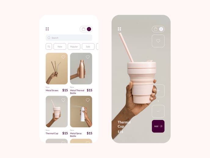
20. Product search by Bruno Vasconcelos
What we love about this design: tidy layout, scoped search, prominent visual theme
Product search apps are frequently over-detailed and disorderly. Instead of providing help, they confuse and annoy the user. This mobile app design is their exact opposite. It sticks to a natural, harmonious color scheme, gets rid of unnecessary details, neatly organizes the content using tags, filters, and categories, and is optimized for mobiles. It ticks all the boxes!

Source: Dribbble
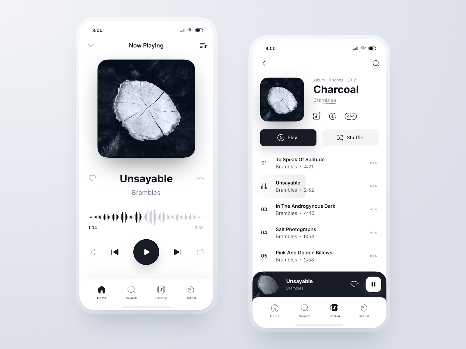
21. Music player by Anton Lepko
What we love about this design: analog feel, soothing design, hyper-minimalism
The last mobile app featured today has been stripped down to essentials. It removes all clutter and noise, scraps color and animations, and decreases complexity. A simple interface helps the user concentrate on consuming the content instead of getting sidetracked by decorative features. Paper texture and matt finish provide a pleasant tactile experience and inspire a sense of comfort and calm.

Source: Dribbble
Takeaway
How do you like the featured UI designs? Most of them look so modern and minimalistic that it’s easy to take them for granted, thinking they are a breeze to implement. But don’t be deceived by the supposed simplicity of these designs. You know, “simple can be harder than complex,” as Steve Jobs once said.
So if you would like to create a similar UI but need the right people to implement your vision, we can help you out. Our talented mobile designers will turn your idea into a great mobile app that will delight your users and help you grow the competitive advantage based on minimal direction.



.gif?width=456&name=AR-experieence-home%20(1).gif)
